"X" Marks the spot.
Fashion Design.
Art.
Industrial Design.
Branding.
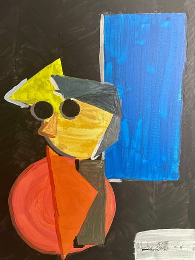
The "X" represents the corner marker of graphic design, where to anchor the logo, and 1/3 shapes (Triangles, circles, X's).
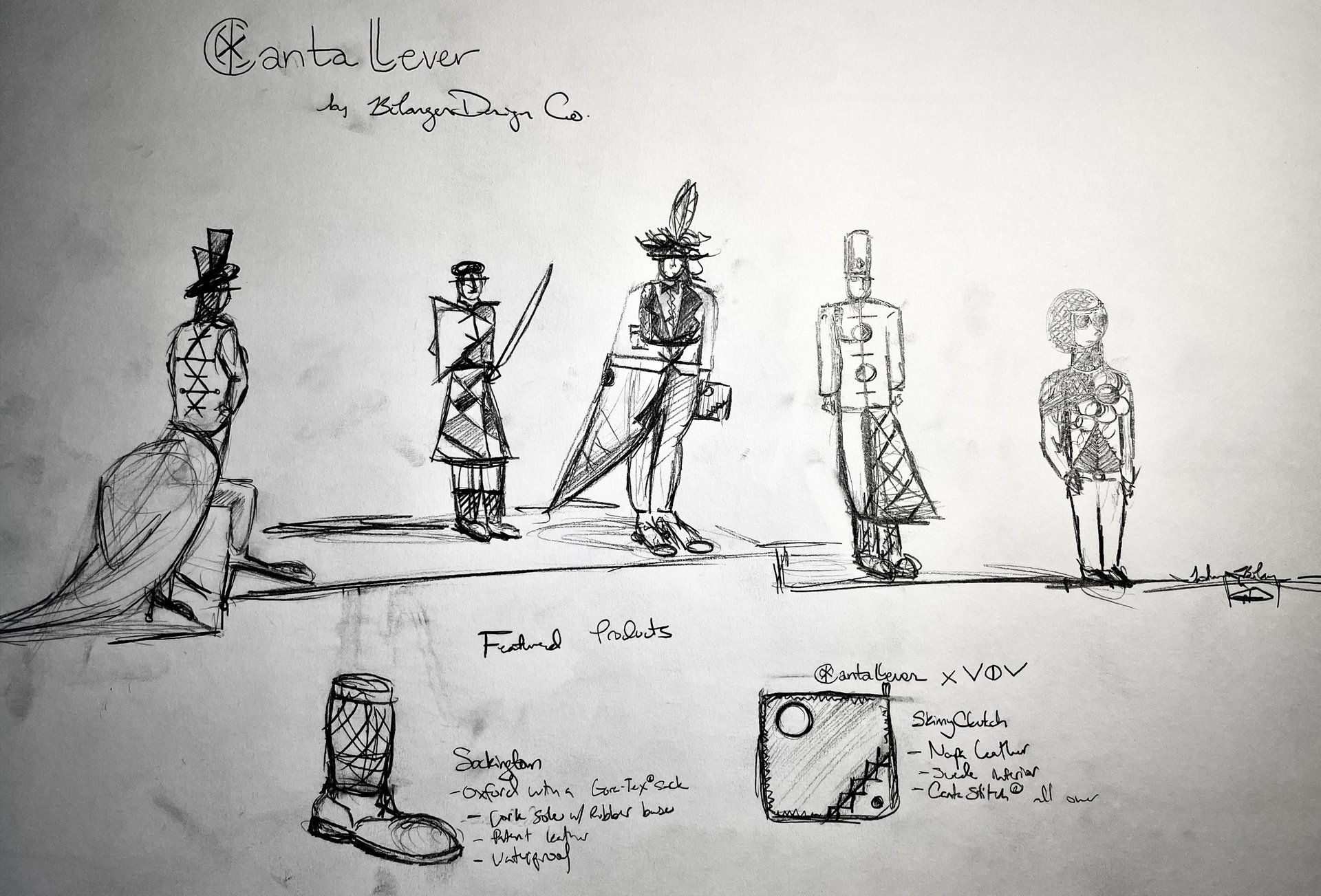
Étranger. Érratic. Éccentric.
Founded in Chicago, Illinois, USA, on the 12th of February of 2012, it focused on designing vehicles, and gargantuan avant-garde edifices. I have been building on that initial though along with me for the past 11 years, and the results have been immediate. Fashion. Product. Web. Photography. Bélanger Design Co has been growing endlessly from a hobby, to a side hustle, to a labour of love, and now, finally, into my dream, my career, my company, my first-born baby! And it has been my privilege to bring it along, and share with you all of my hard work culminating from the past 11 years. May the next 19 years be vivant!
Madame Sibarita & Monsieur Siroche.
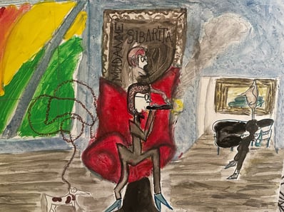
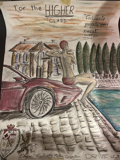
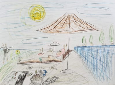
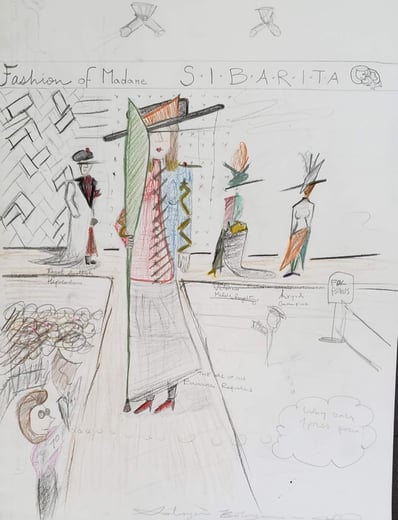
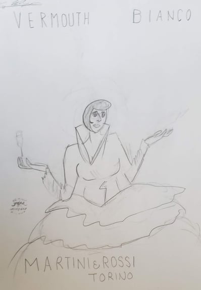
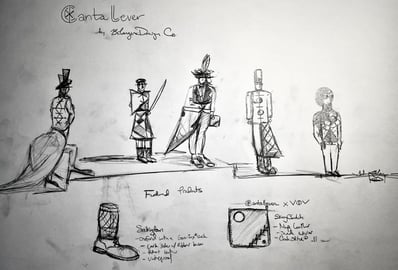
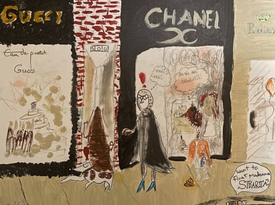
This iconic duo was created in 2016 (10 years old), as a female persona of Monsieur Bélanger, just as an idea. The series continued into a full-blown collection with stories, and characters. They are the ambassadors of the Bélanger Brand.
Maybe I should make Monsieur Siroche and Madame Sibarita stuffies in the future!
Madame Sibarita is a snob, middle-aged upper-class woman who enjoys good wine, Bélanger Vehicles and designs, luxury goods, her bull terrier, and her servant, Monsieur Siroche; a black alien who is an absolute expert in all that is exceptional service.
Madame Sibarita (before she retired) was a fashion designer and represents Mr. Bélanger's creative visions as her own.
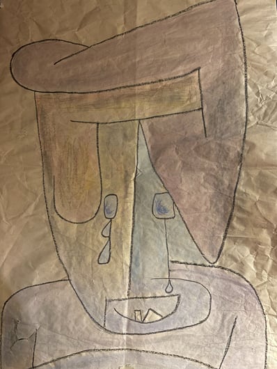
The character of Madame Sibarita is loosely based on my Abuelita's life and my passions and based on Paul Klee's weeping woman.



Partnership.
VOV Leather Goods.
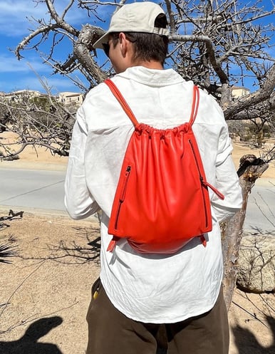
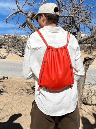
Bélanger Design Co. has long partnered with Mexican leather goods company, VOV Leather Goods. Handcrafted in México, they are Mr. Bélanger's go-to for leather products.
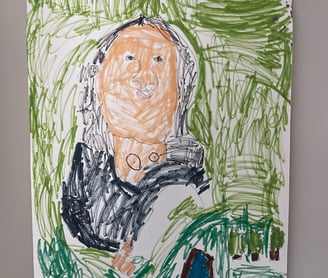
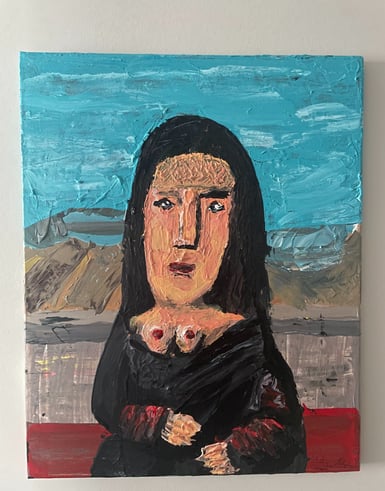
2011. (5 years old.) 2023
The Flashing Mona Lisa.
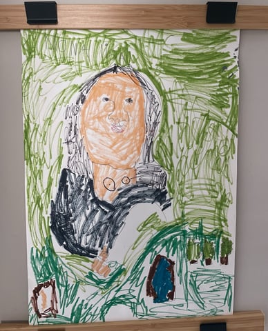
Here's the story. When I was in Kindergarten, my art teacher, Ms. Cabrera (Shoutout to her; an amazing art teacher) told us to make a drawing of the Mona Lisa. And I did it, as you can see, but it was missing something.
"Cleavage," I said, but not that word, I'm paraphrasing. It needed more oomph to her bosom. More depth. More Conkers! So I started at a normal level to draw them, concealed by clothing, but it was not visible at all. So Each time, I drew them higher, until I took a sharpie, and just put it on her goddamn neck, and said "There. That's better.". Ms. Cabrera looked at it, died of laughter, and showed it to my mum, and she also died of laughter. And no, it wasn't pornography, it was art. So, of course, I did well on it.
Fast-forward to 2023, when I found it in a box, folded, and I wanted to recreate it. But not with the Louvre colour scheme, no, but the Prado colour scheme, like the one that I saw at the Prado in Madrid. So I did it, I'm not the best painter, but it's interesting, nevertheless, and her rack would make my 5-year-old self proud, and ask "how did you do that?!". I'd tell him "Patience."
I think it's cute, but it is definitely not my best-quality work. For that, check my portfolio.
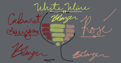
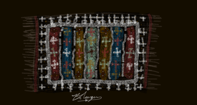
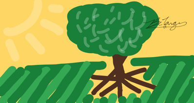
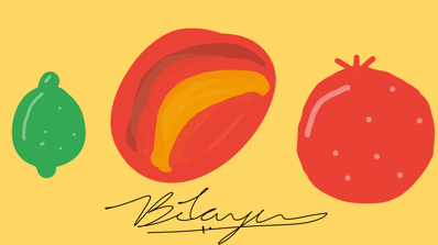
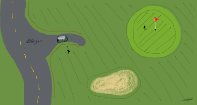

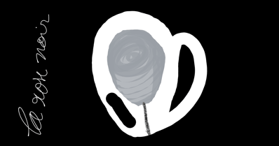
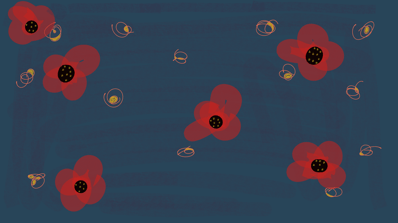
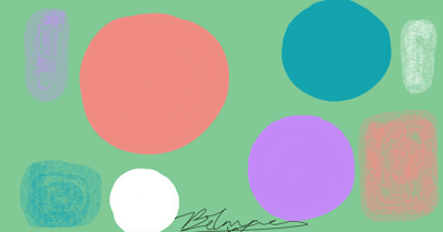

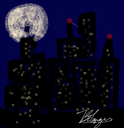


2018.
The Canvas Collection.
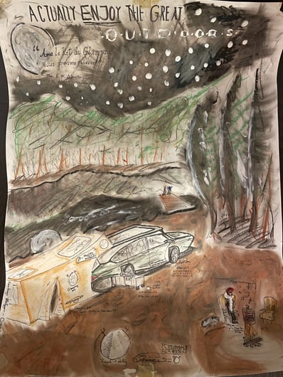
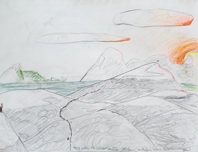
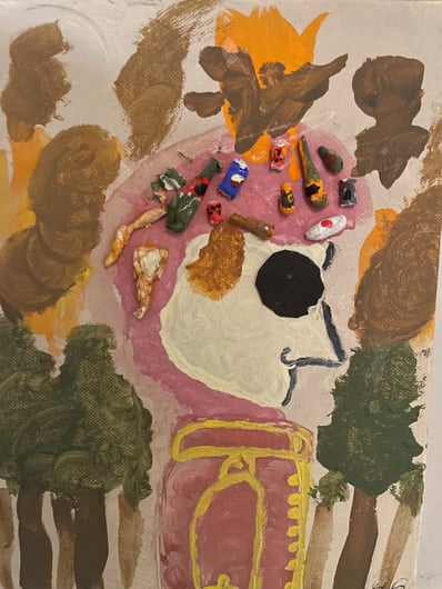
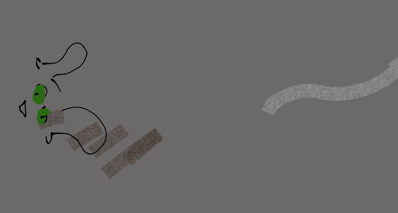
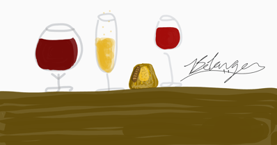
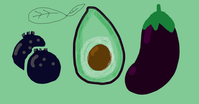
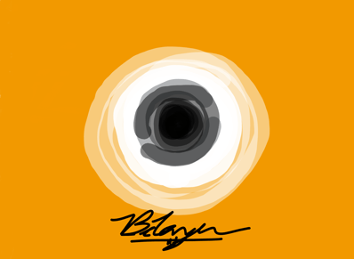
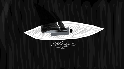
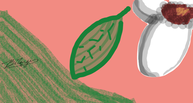
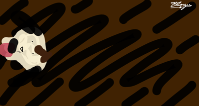
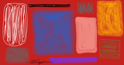
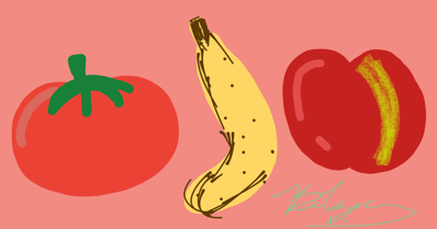
Using Chrome Canvas with my old Chromebook, I made a medley of these pieces.


The Bélanger Coat-of-Arms.
I was looking at the Bélanger Coat of Arms and found it rather tacky. Generic, uninspired.
Is that really the coat of arms of my paternal family? Really?
Clearly, all the design talent came from my mum's side of the family.
So here's what I did:
1. Let's make it look better
2. Let's modernise it
3. Let's keep hommage
4. Let's make it iconic; something easy-to-draw, and simple.
I went full-on minimalist and constructed this.
A play on my "X" logo (for my design division), I integrated the yellow, blue, and poppy colours as they were intended.
I wanted to keep the shapes primary, like the colours, so I've simplified the lion above to a red triangle and removed all ornamentation that's unnecessary. If the embellishments looked good and detailed, I would have kept them; and embraced them.
I turned the knight into a grey diagonal line and framed it all with a black ring.
Sometimes minimalism looks good; looks bold and creative.
Have y'all seen the progression of my signature yet? Check my Instagram car renders and whatnot to further see. Now let's talk brand identity.
Helvetica Neue with Rounded Dots.
Beige or off-white Background with this selection of Oranges, Poppies, Rouges, Saddle, Terracotta, and Coral.
Colours must always naturally compliment one another.


